| --/> | from ossama · 1738138330739.0 reply |
| re: | [image] · 1738136546144.0 by q |
W dad, keep winning
| --/> | from q · 1738136546144.0 reply |
| re: | guys i think my dad got taller by quewon |
q1 : 0
dad : 1
| 1 reply |
| --/> | from quewon · 1738136029030.0 reply |
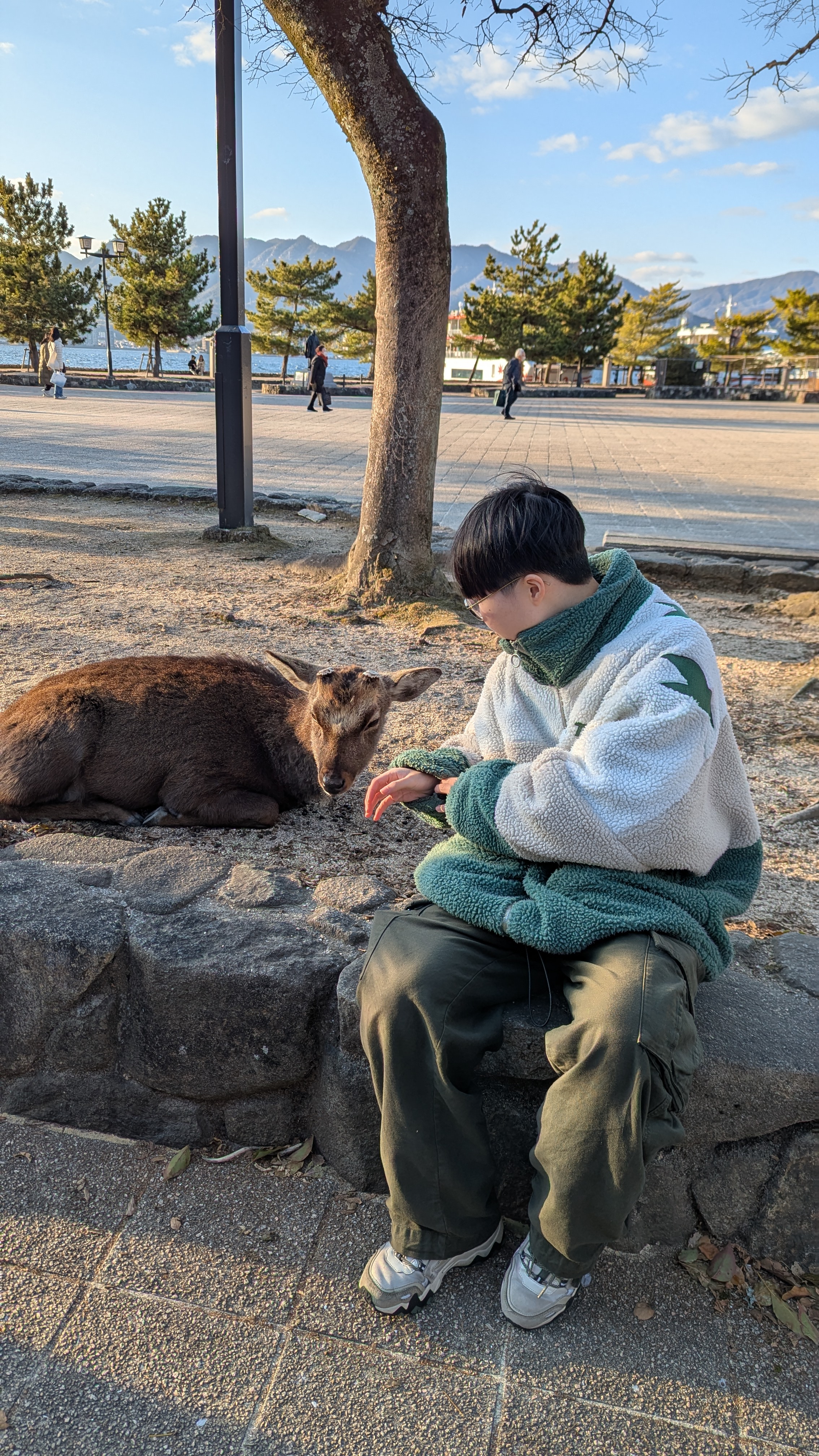
guys i think my dad got taller
i cannot let him win this race
| 2 replies |
| --/> | from ossama · 1738087292049.0 reply |
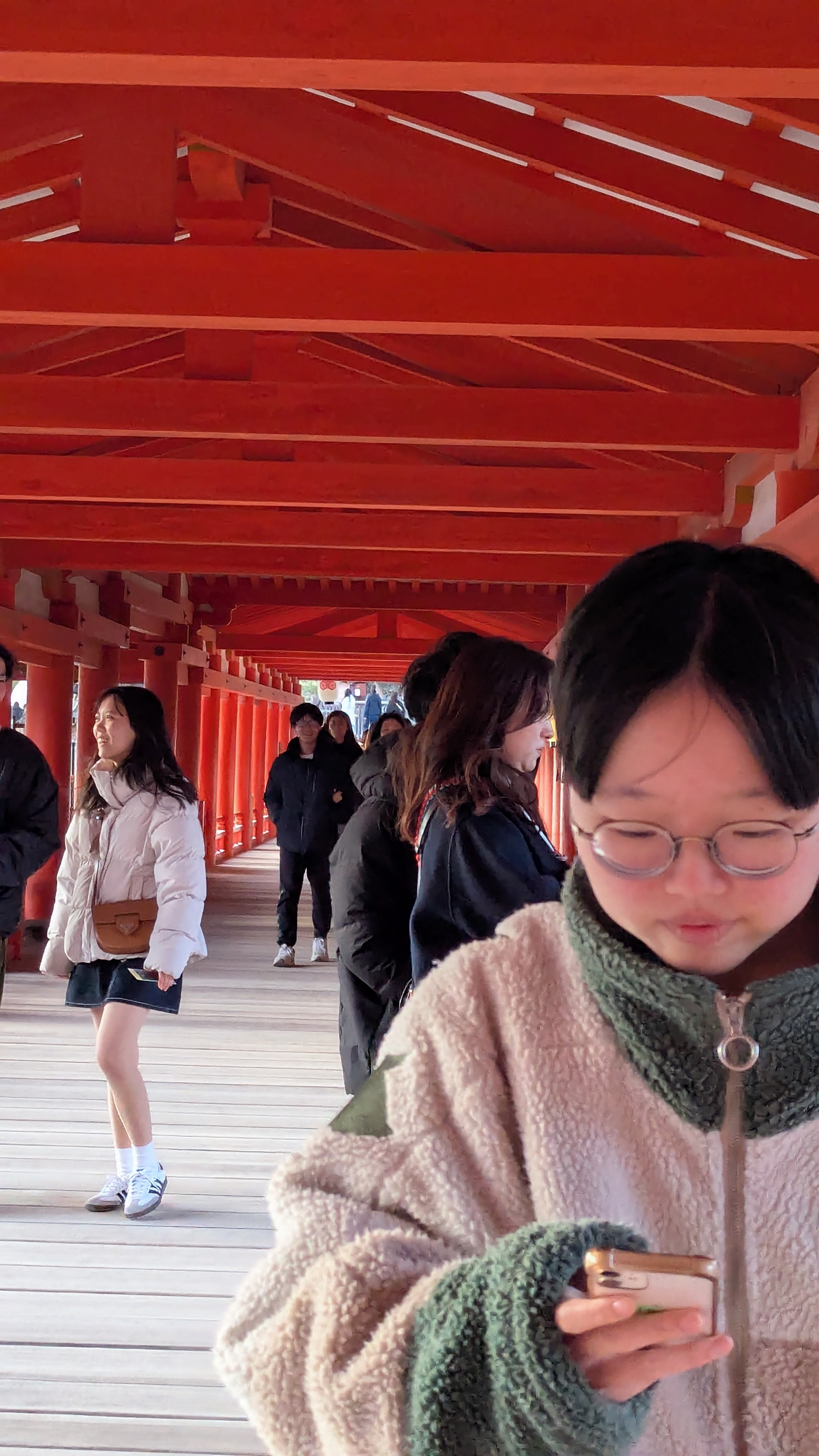
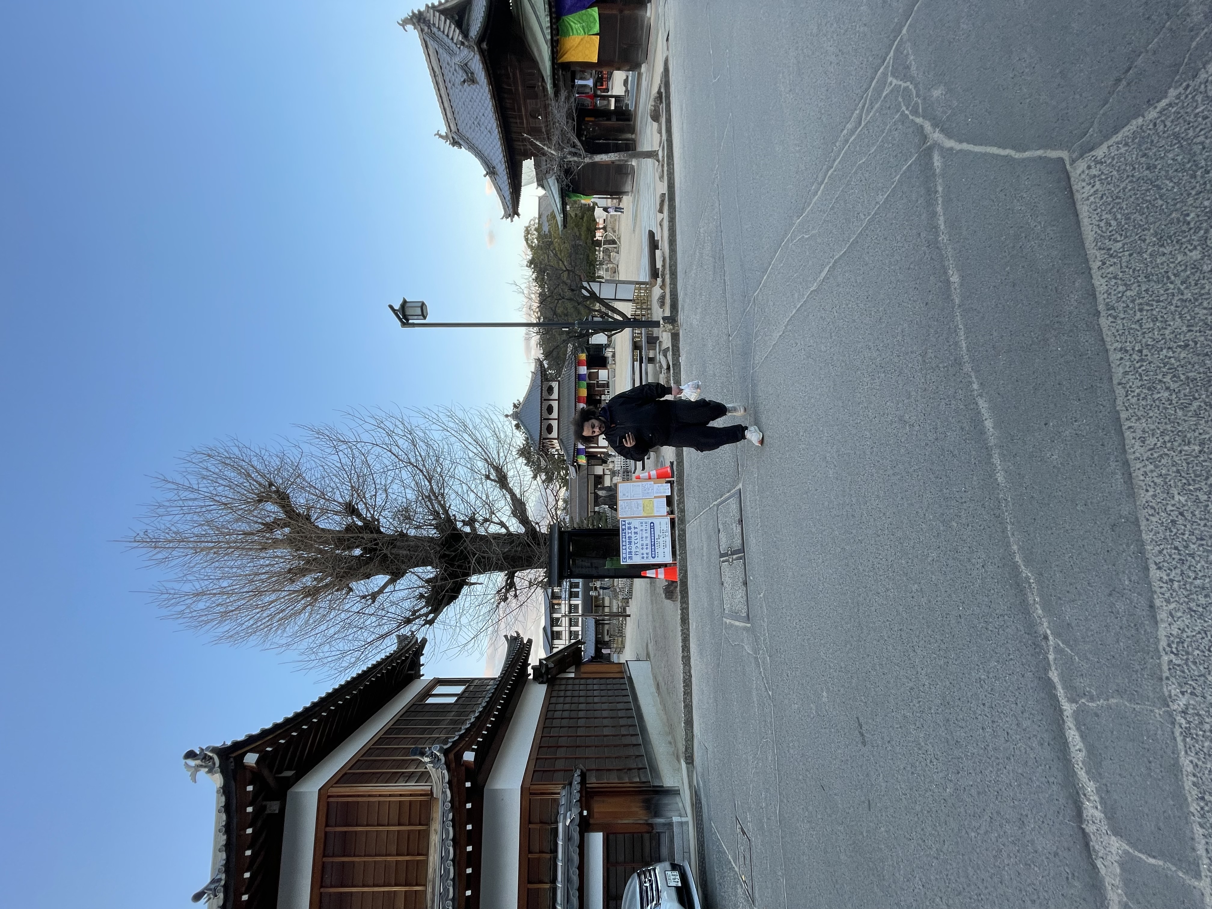
Quewon repeatedly getting in front of things I wanna take pictures of
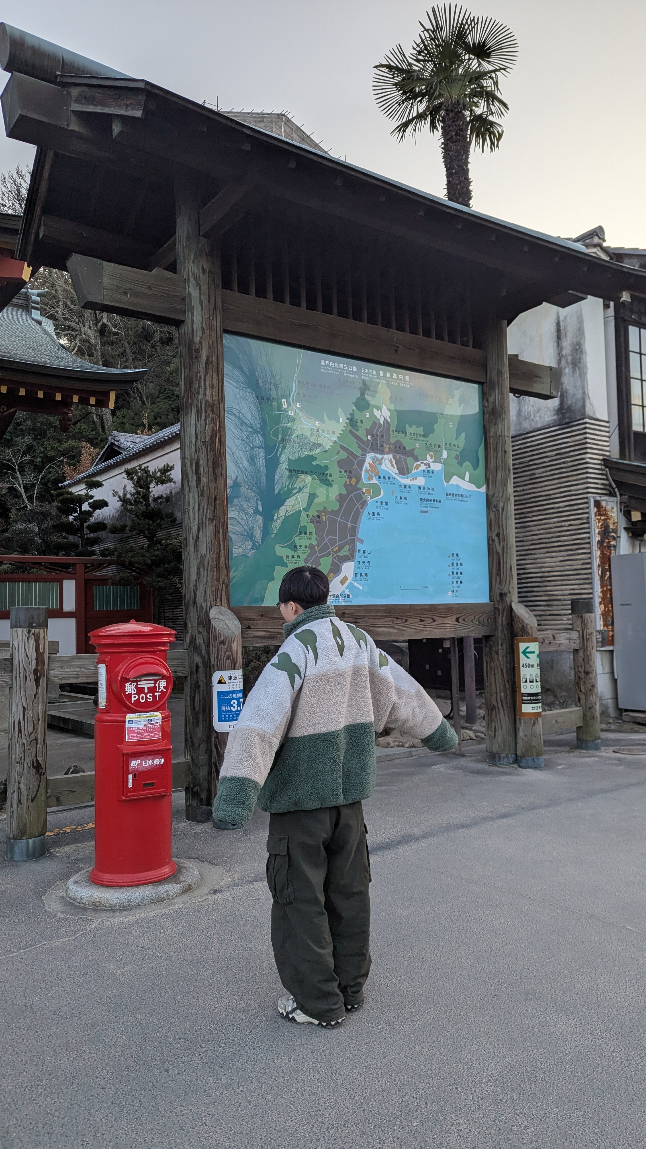
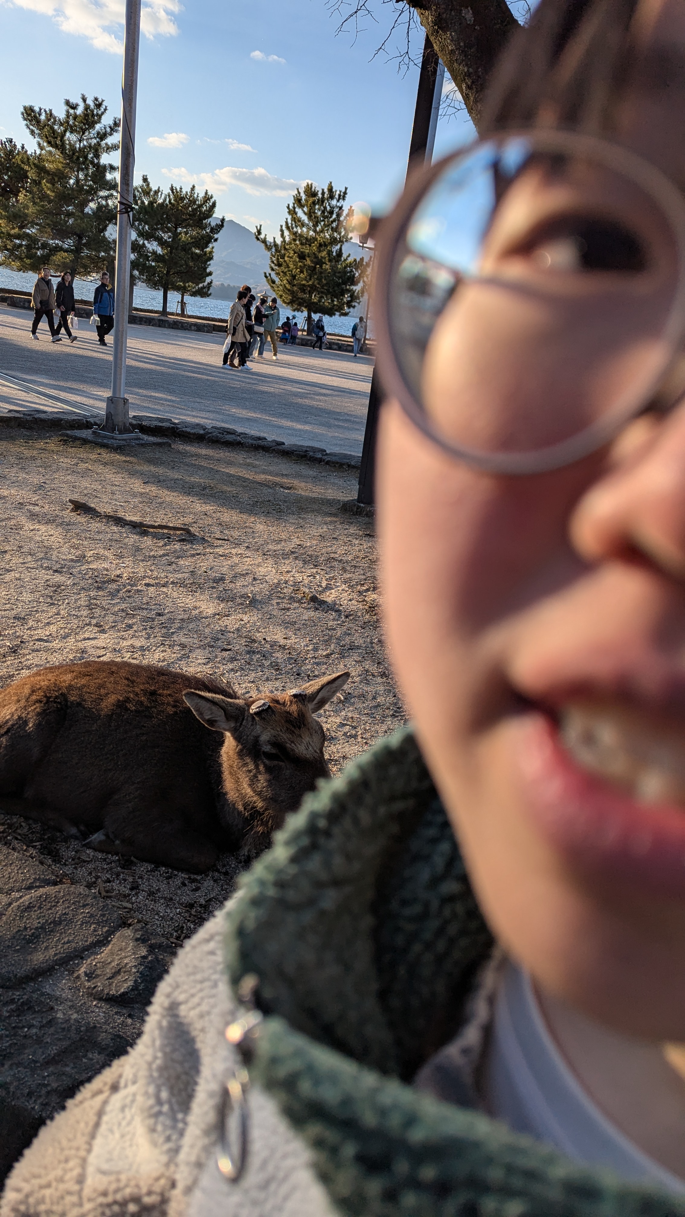
| --/> | from ossama · 1738087087293.0 reply |
Pic of quewon seconds before the tragic incident that cost him a finger
| --/> | from ossama · 1738086885980.0 reply |
| re: | [image] · 1738081012754.0 by adam |
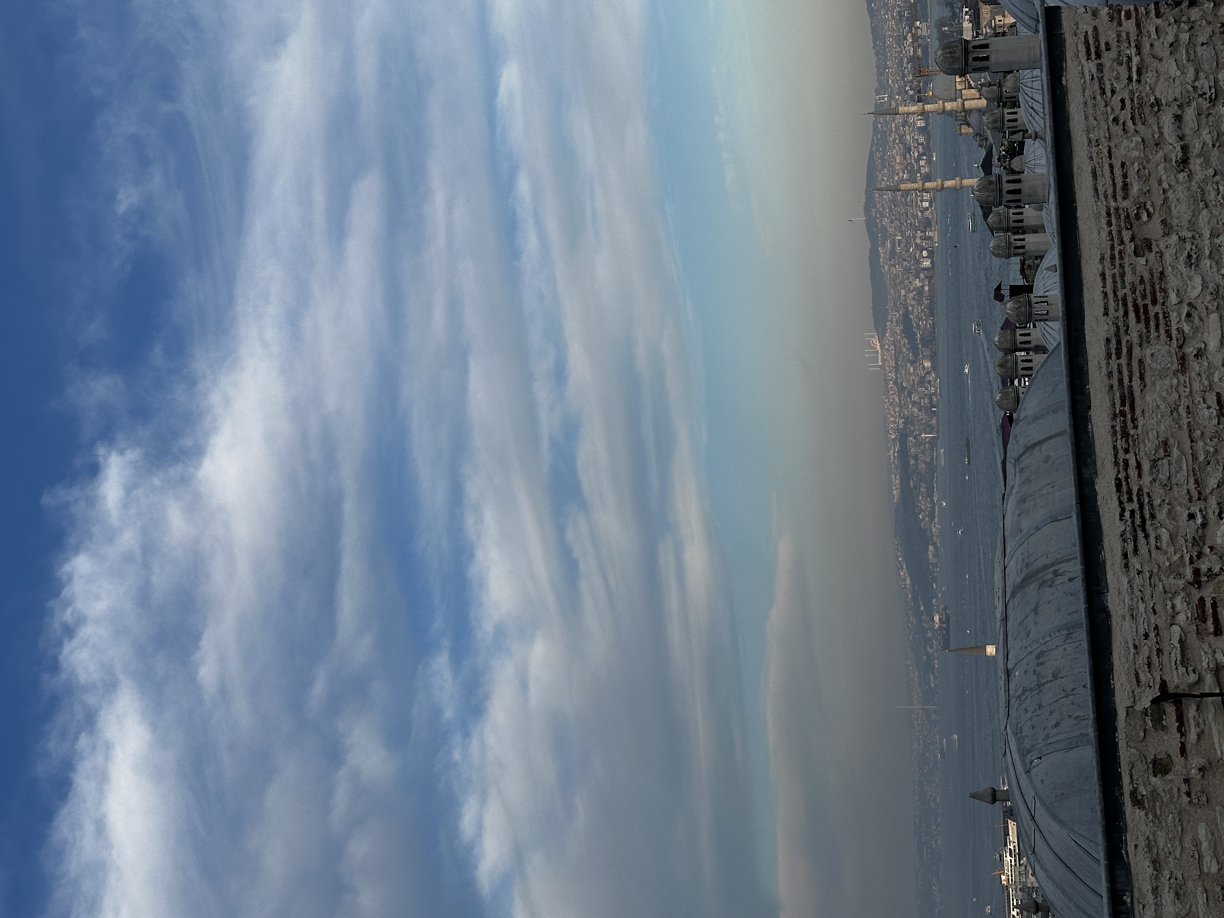
You guys should send more pics of istambul