| --/> | from adam · 1738081012754.0 reply |
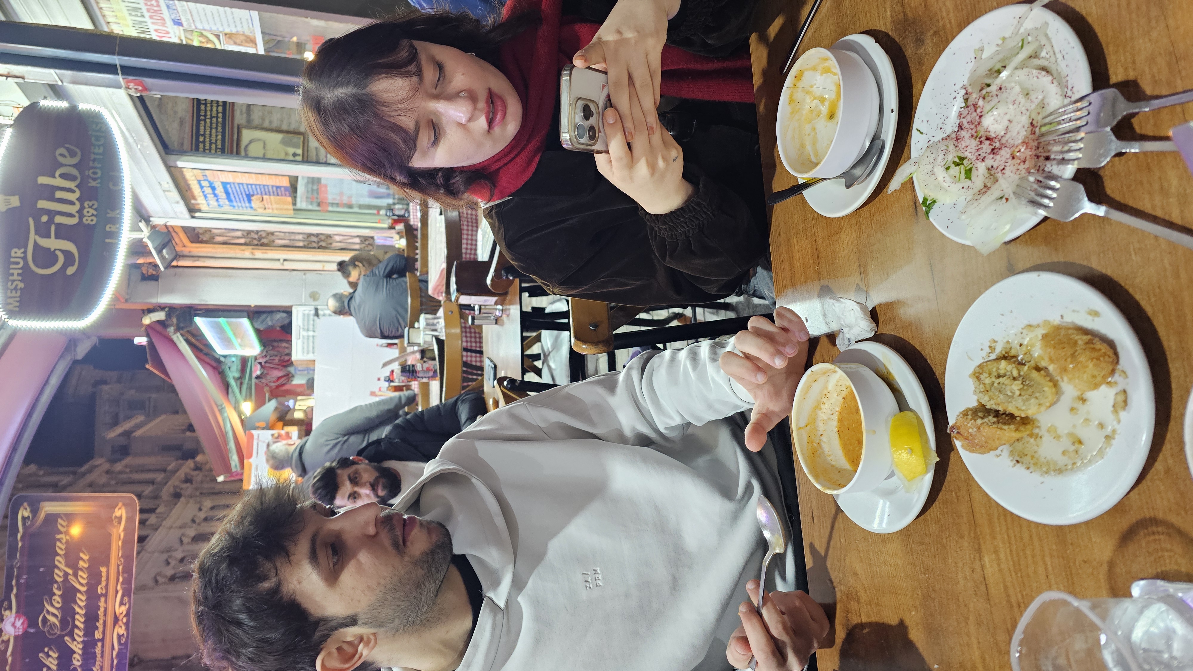
pictured: ayla (number one untitled social ambassador) showing off our wonderful social media to her friend
| 1 reply |
| --/> | from adam · 1738081012754.0 reply |
pictured: ayla (number one untitled social ambassador) showing off our wonderful social media to her friend
| 1 reply |
| --/> | from ossama · 1737812789641.0 reply |
| re: | i am big bro >:( get ur family tree fact by q |
straight????? wowwwww....
| --/> | from q · 1737812428873.0 reply |
| re: | You were already peak lil bro by ossama |
i am big bro >:( get ur family tree facts straight
| 1 reply |
| --/> | from ossama · 1737812383583.0 reply |
| re: | [image] · 1737795822688.0 by q |
You were already peak lil bro
| 1 reply |
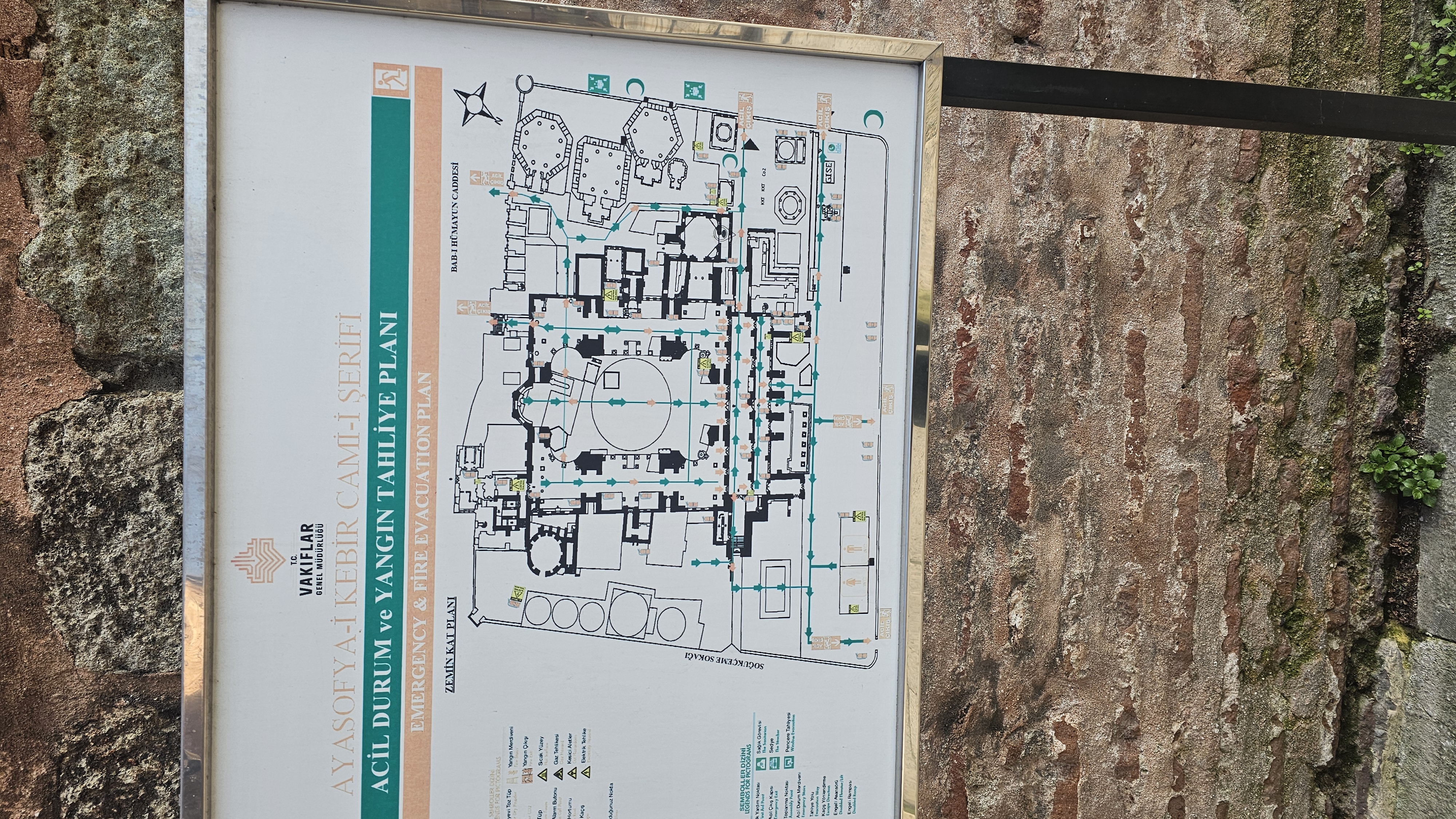
| --/> | from q · 1737802570529.0 reply |
| re: | [image] · 1737622389619.0 by Ayla |
i think the lack of contrast and illegibility makes it a lacking design. some recs —
| --/> | from emma banana · 1737793143228.0 reply |
ok my previous attempt at posting this seems to have disappeared into the void despite my having clicked post
but yes new piercimg