| --/> | from ossama · 1737637172540.0 reply |
| re: | i think the font, images, symbols and co by quewon |
I feel like a small outline or a slight blurry glow would help a lot with readability without making the whole thing dimmer
| --/> | from ossama · 1737637172540.0 reply |
| re: | i think the font, images, symbols and co by quewon |
I feel like a small outline or a slight blurry glow would help a lot with readability without making the whole thing dimmer
| --/> | from quewon · 1737637001536.0 reply |
| re: | imo i like that the contrast is a bit of by adam |
i think the font, images, symbols and colors already give it that nice authentic vibe so improving readability wouldn't hurt it!
| 1 reply |
| --/> | from adam · 1737632150642.0 reply |
| re: | yes but i think you should make the gray by quewon |
imo i like that the contrast is a bit off, it makes it feel somewhat analogue / artistic. though, depending on the print it might come out fainter still so it's a good point. maybe do a test print?
agree on the icons though, they should also have a consistent optical size
| 1 reply |
| --/> | from quewon · 1737630482043.0 reply |
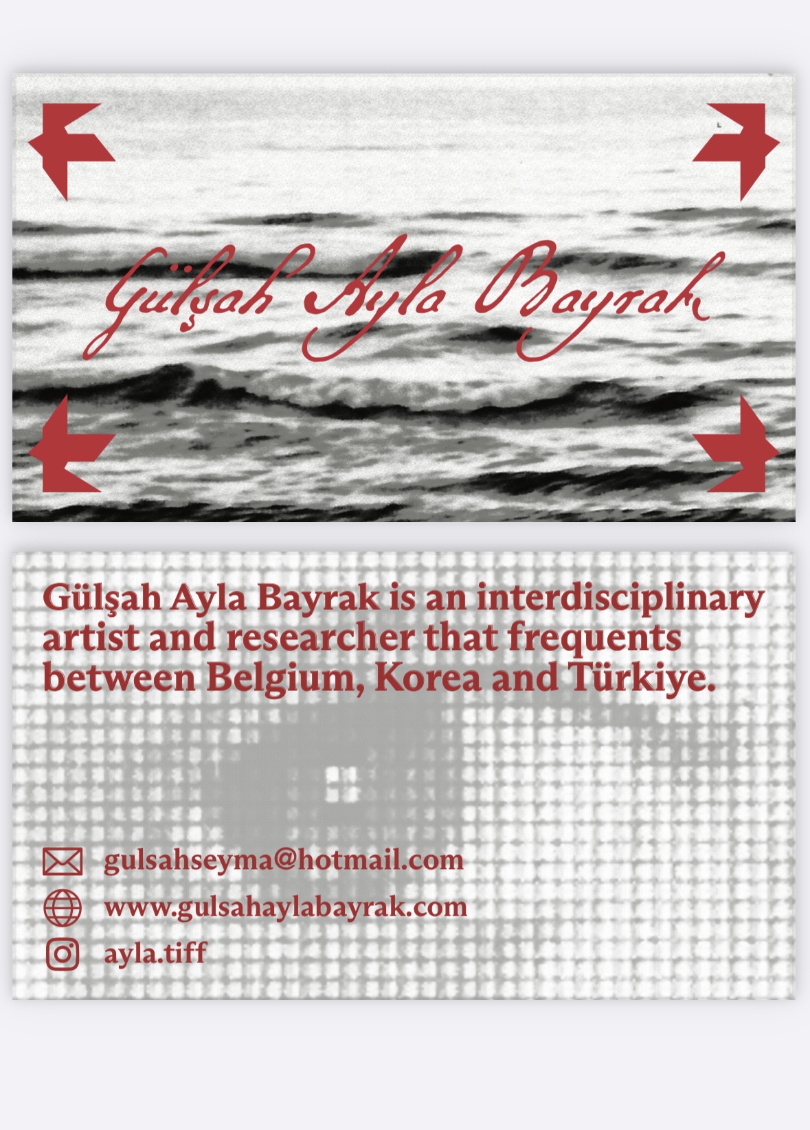
| re: | [image] · 1737622389619.0 by Ayla |
yes but i think you should make the grays and blacks fainter so that it contrasts with the text more. also use icons with similar line thicknesses?
| 1 reply |
| --/> | from emma banana · 1737624476273.0 reply |
| re: | [image] · 1737622389619.0 by Ayla |
depends on the impression you want to give really. what’s the image you’d like to present
| --/> | from ossama · 1737485629025.0 reply |
| re: | yeah i already quit haha it was more of by adam |
Can I also slide