| <\-- | from Ayla · 1737622389619.0 reply |

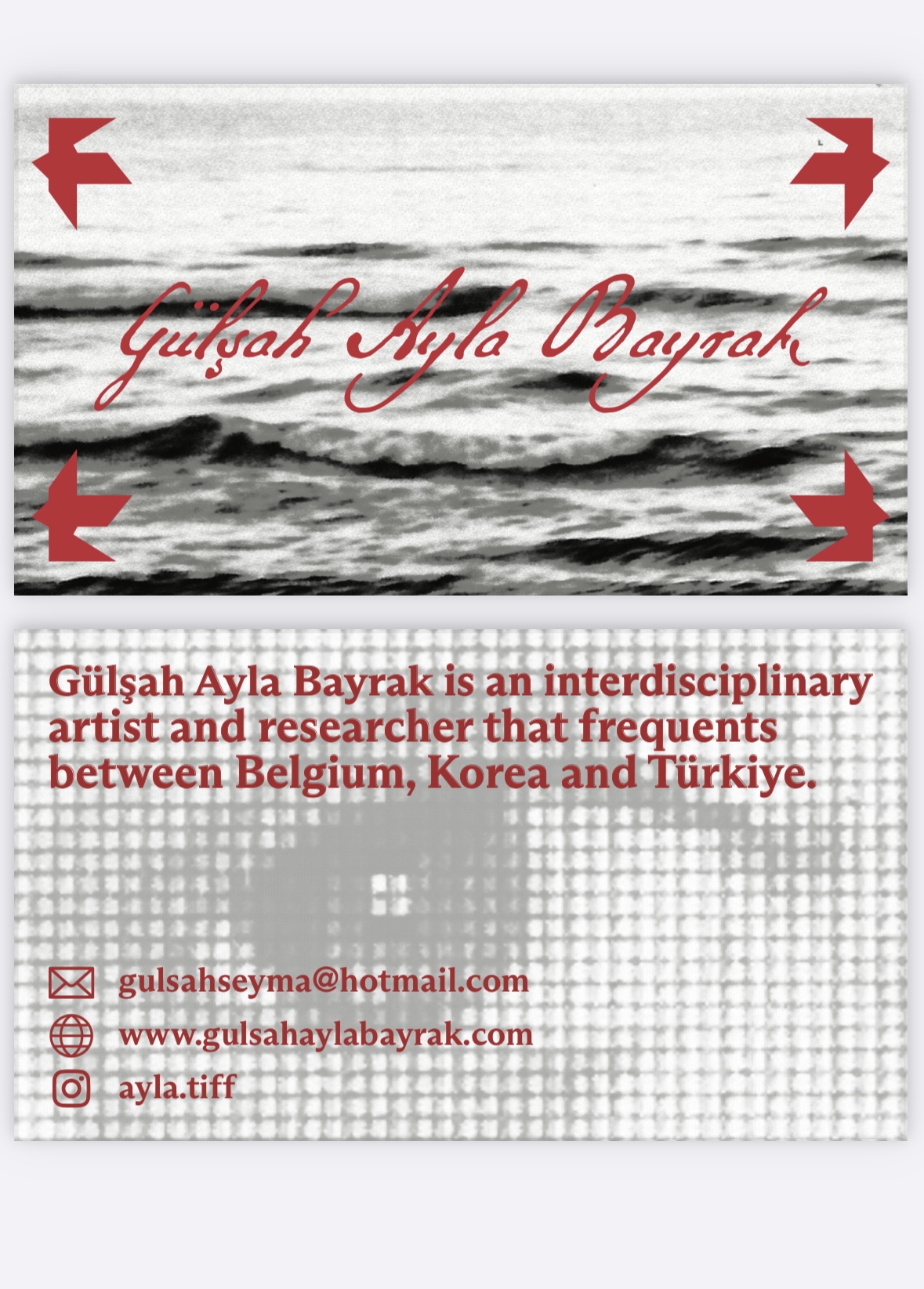
Is this cute ?
replies:
| --/> | from q · 1737802570529.0 reply |
i think the lack of contrast and illegibility makes it a lacking design. some recs —
| --/> | from quewon · 1737630482043.0 reply |
yes but i think you should make the grays and blacks fainter so that it contrasts with the text more. also use icons with similar line thicknesses?
| 1 reply |
| --/> | from emma banana · 1737624476273.0 reply |
depends on the impression you want to give really. what’s the image you’d like to present